PAX & PARKER
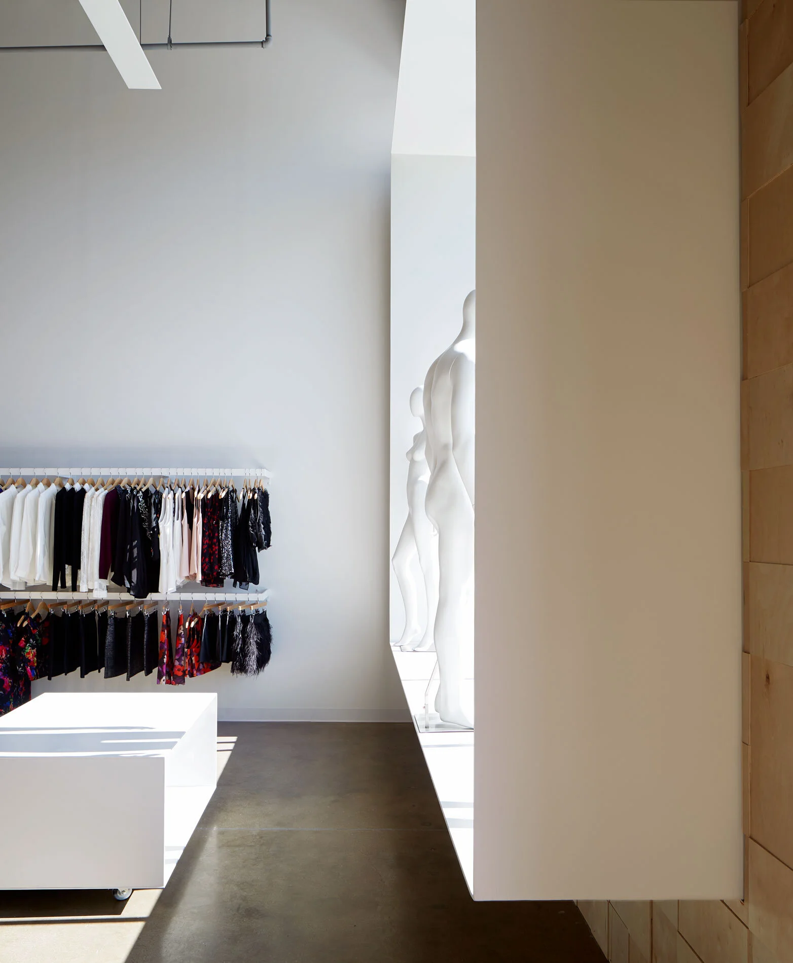
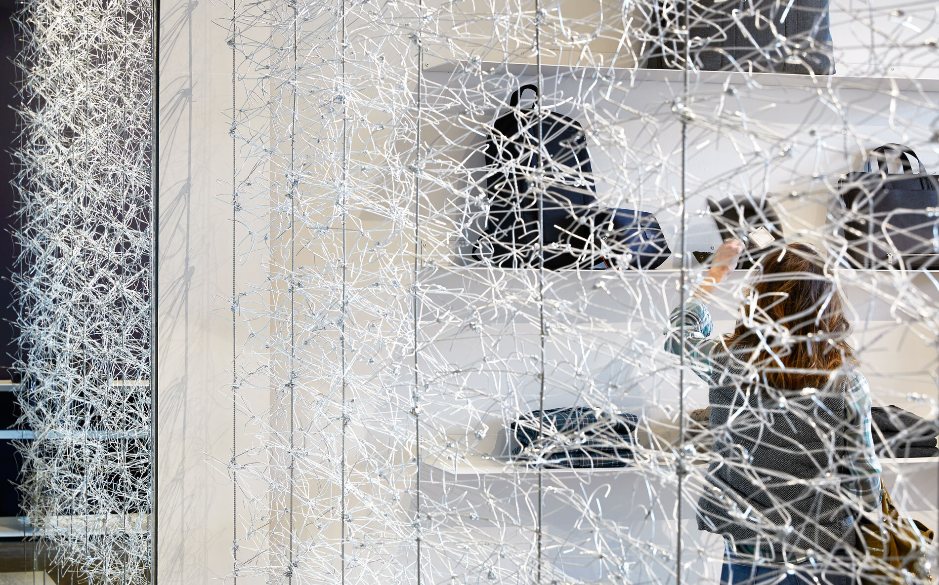
Pax & Parker is a new boutique fashion retailer. This is their first store and came to the Architect with a white square logo and a small budget. The existing concrete shell structure was left exposed. The concrete slab was sealed. The steel plate fixtures were designed for the space and fabricated by a local community college welding instructor. The general lighting in the retail space was created by mounting fluorescent strips mounted to the top of a bent steel plate, painted white. Birch plywood of varying thicknesses was cut into 8 inch squares and added to portions of the walls near the entry. White wire hangers were made into modules by the designers office. These were attached to steel cables to create the screen between the dressing and retail areas. The space is dominated by this veil of 1,800 white wire hangers. The wall is formed by 150 modules made up of 12 hangers in the same configuration. The interlocking of this base unit forms a lace-like appearance, that glimmers in the light. These are objects we interact with everyday. They rattle around in the bottom of our closets, reintroduced at Pax & Parker, we experience them in a different way.


